GoDaddy
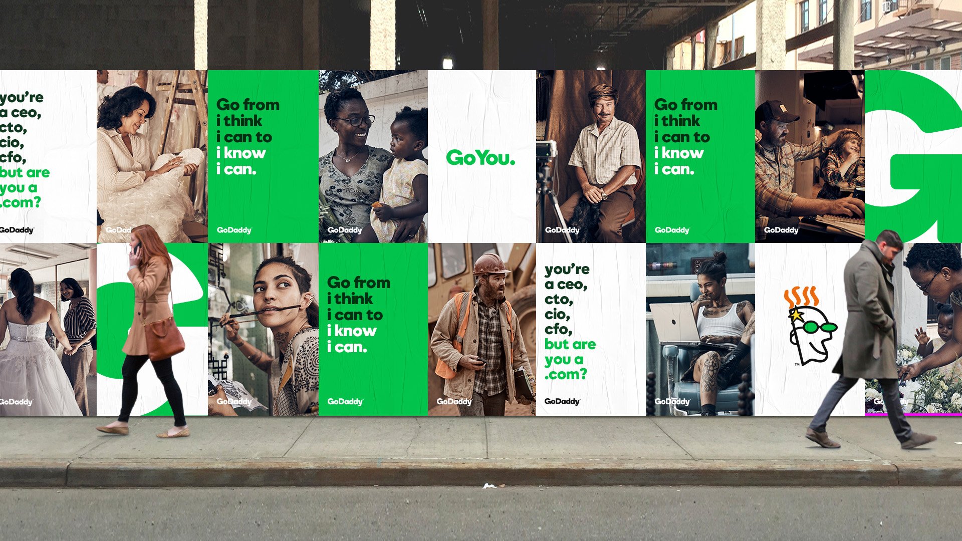
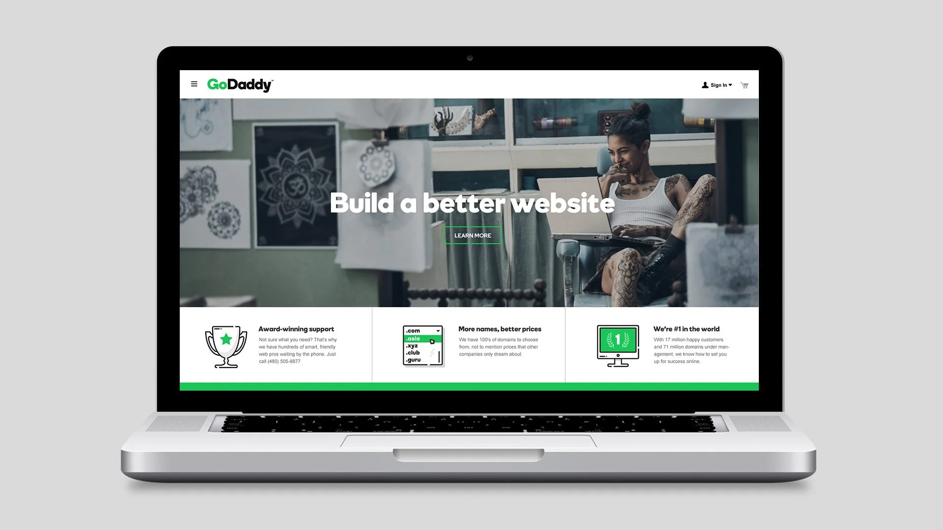
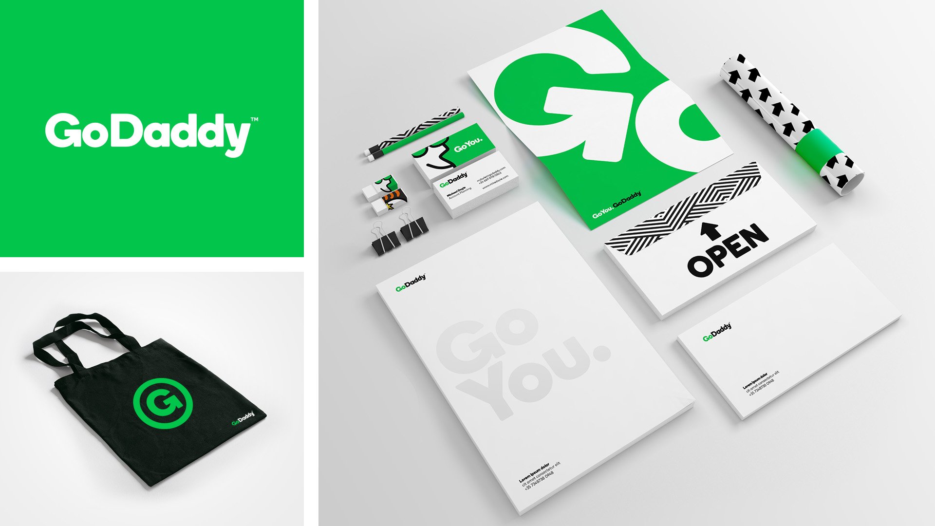
By 2015, GoDaddy needed to evolve beyond its dot-com era reputation to better reflect the hustle of modern entrepreneurs. We executed a comprehensive visual overhaul that stripped away the dated aesthetics to introduce a cleaner and more purposeful logotype. A key move was subtly integrating an arrow into the letter G to symbolize the inherent "go" spirit of the user base. We collaborated with type designer Henrik Kubel to develop a custom bold sans-serif typeface that gave the brand a proprietary voice. To complete the system, we created a new library of custom illustrations and paired them with gritty and authentic photography of real people to establish a look that felt both digital and deeply human.
Role: Lead Designer
Design Direction: Melatan Riden